Tips for Selecting the Perfect Color Palette for Your Decor
Choosing the right color palette for your decor can be a transformative experience, not just for your space but also for your mood and well-being. At auradecorart.com, we understand that color is more than just a visual element; it’s an emotional one. With the rise of e-commerce in the home decor sector, particularly during the pandemic, consumers have become more discerning about their choices. According to a recent report, the global home decor market was valued at approximately $663 billion in 2021 and is projected to reach $838 billion by 2027, reflecting a compound annual growth rate (CAGR) of 4.5%. This growth underscores the importance of making informed decisions when it comes to selecting decor items, especially color palettes.
Key Insight: The increasing market size indicates that consumers are investing more in their living spaces, making it essential to understand how color influences their purchasing behavior.
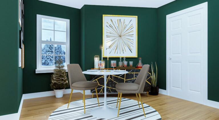
When selecting a color palette, the first step is to consider the purpose of the space. For instance, a living room may benefit from warm, inviting colors that encourage social interaction, while a bedroom might be better suited to cool, calming tones that promote relaxation. Research shows that colors can evoke specific emotions; for example, blue is often associated with tranquility, while yellow can stimulate feelings of happiness and energy.
Next, think about the existing elements in your space. If you have a statement piece of furniture or artwork, let that guide your color choices. A bold piece can serve as an anchor, allowing you to build a complementary palette around it. For example, if you have a vibrant piece of art featuring reds and oranges, consider pairing it with neutral tones to balance the intensity and create a cohesive look.
Another important factor is the size and lighting of the room. Lighter colors can make a small space feel larger and more open, while darker shades can create a cozy, intimate atmosphere. Natural light also plays a crucial role in how colors appear; a color that looks great in the store may appear different in your home due to varying light conditions. It’s advisable to test paint samples on your walls and observe them at different times of the day before making a final decision.
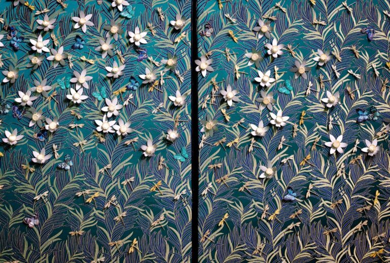
Incorporating trends can also enhance your color palette, but it’s essential to do so thoughtfully. The Pantone Color Institute, known for its color forecasting, has highlighted that earthy tones and muted shades are gaining popularity, reflecting a collective desire for comfort and connection to nature. However, while trends can provide inspiration, it’s vital to choose colors that resonate with your personal style and preferences. After all, your home should be a reflection of who you are.
When it comes to creating a harmonious color palette, the 60-30-10 rule is a helpful guideline. This rule suggests that 60% of the room should be a dominant color, 30% a secondary color, and 10% an accent color. This approach ensures balance and visual interest without overwhelming the space. For example, in a living room, you might choose a soft gray for the walls (60%), a rich navy for the sofa (30%), and vibrant yellow cushions (10%) to add a pop of color.
Lastly, don’t forget about texture and materials. Different textures can affect how colors are perceived. A matte finish may absorb light and create a softer look, while glossy surfaces can reflect light and make colors appear more vibrant. Mixing textures can add depth to your decor, making the color palette more dynamic.
In conclusion, selecting the perfect color palette for your decor is a multifaceted process that involves understanding the emotional impact of colors, considering existing elements in your space, and being mindful of trends and personal style. As the home decor market continues to expand, platforms like auradecorart.com offer a plethora of options to help you curate a space that not only looks beautiful but also feels like home. By applying these tips, you can create a color palette that enhances your living environment and reflects your unique personality.